Wool Bee | Emprendimiento
-
 Carlos Brignardello
 - 05 Feb, 2023

This project is actually close. If you are interested in this project, you can contact me in Linkedin.
Project brief
About project
Wool Bee was a project that was looking to improve and facilitate the way of the clients can start digitalize their brand and products with the contratration of service packages.

About Team
This project was developed entiredly by myself, however I have the support of Felipe Madariaga and Edison Vasquez in the marketing and business analytics work and cooperation.
Technologic Stack
The Stack use for this project is the following:
- Nextjs: Each service has their own route inside /services/, this is easy to do with other tools like react-router, but next simplify and improve this like of stuff. Also I choose Nextjs because improve our project in several ways: Performance, SEO, Server side rendering, etc.
- emailjs: This library is use to easy manage mails. In the project when one client fill their data and choose the category of the service and the specific service inside their specific category we trigger an email to their mail accounts with the information of the service choose and the link for one meeting to define the service.
- Tailwind: This very popular library help us for build beutyful css designs in less time.
- Animation On Scroll: This library is used in the project to animate transitions and the display of new content when the user scrolls down.
- tsparticles: This library is used to create an animated background for the entire website.
Main / Hero section
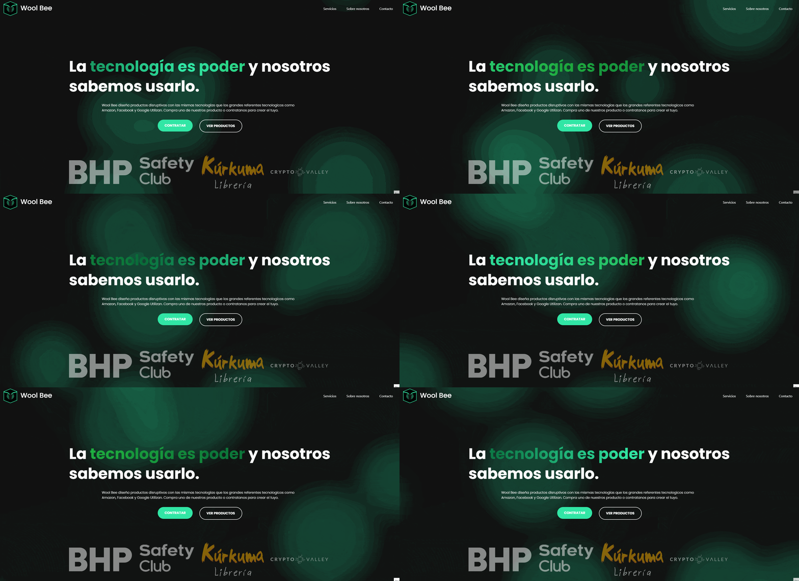
In the main section I looking for a design that looks disruptive and modern, to achieve this I combine the green particle background and the hero text with a power quote that is alredy highlighting the words ‘Technology is power’.
Aditional bellow the hero section the user can see a branch grid to gain trust.

Call to action content
The main idea of this section is incentivate the user to conduct their attention to the main services of the website. That’s the reason because I use more bigger text fonts and good quality images.
In the moment of the develop of this project, Artificial Intelligence and chatgpt was recently massively use that’s the reason beacuse we decide to stand out with a quote our new AI service.
Services display
This section able us to access quickly to all services existing in the website. I use a grid, a collection of icons and the classic title and description.

News section
With the objective of gain more trustly with the customer we decide to add a new sections that links the existing services with success cases.

Service pages
Each project has their own route inside /services that shows the detail of each service in their particular category.
Service category description
When the customer select one of the category services they can read information about the category of services that they found bellow. This information correspond to ‘Why?’ and ‘How?’.
If you pray attention bellow the service category name you can notice that the text is changing showing to the customer the benefits of take one of the services.

Service detail

Logo

Name
Wool Bee sounds like would be. That’s it.
Colors

Font
The main font use in this project is Poppins.